Accessibility Guide
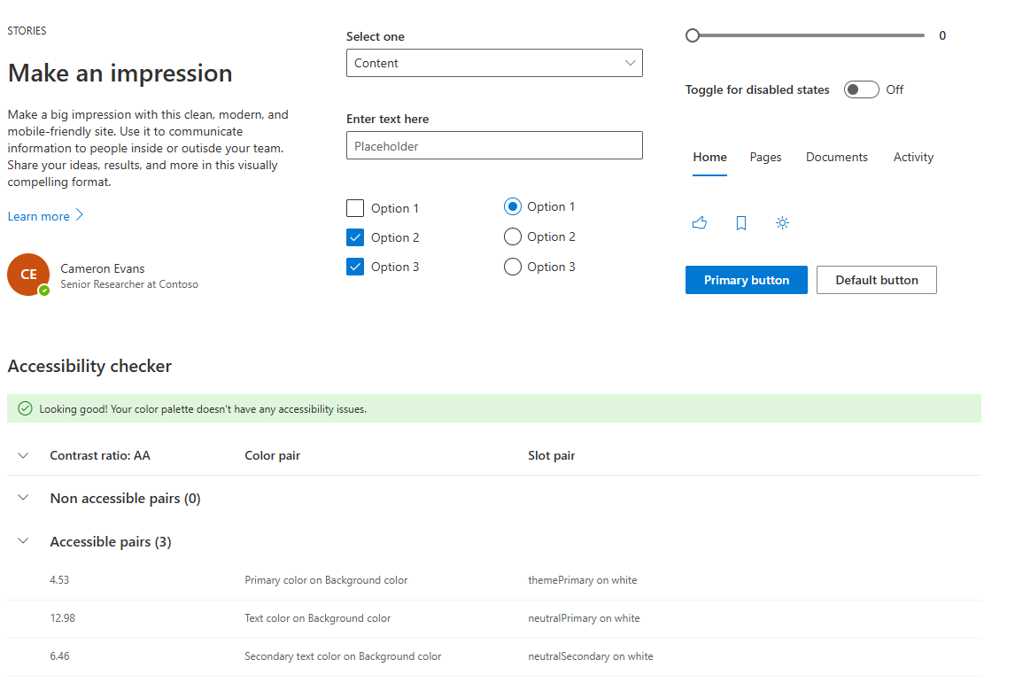
Cards are flexible containers that group related information in a compact block. Their purpose is to highlight content in a modular way within the interface.
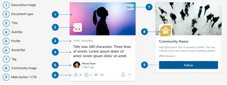
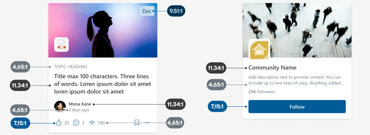
Anatomy
Variants and display forms
There are different types of cards that vary depending on the content they display and how they are visualized.
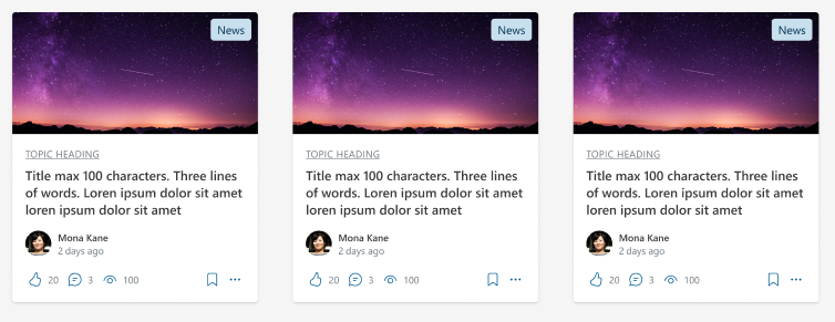
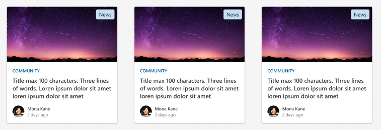
Filmstrip
They are displayed side by side. The “Related content” variant does not include the social bar.
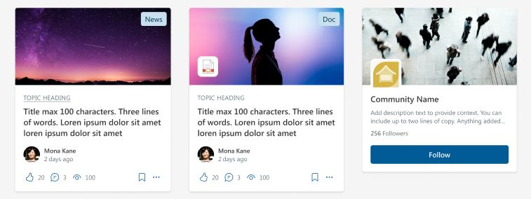
“Related content” variant
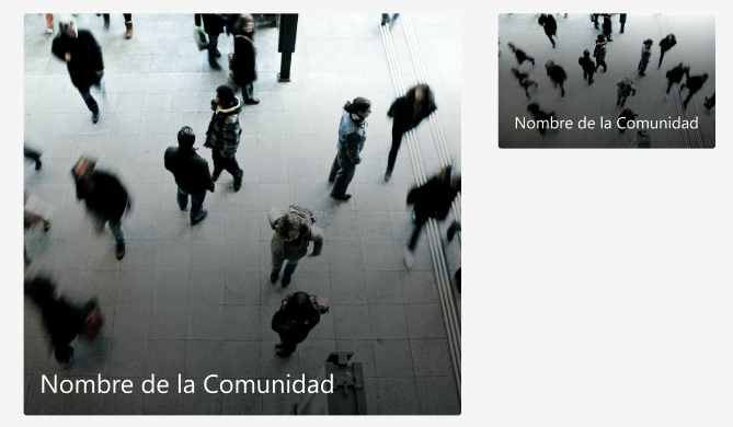
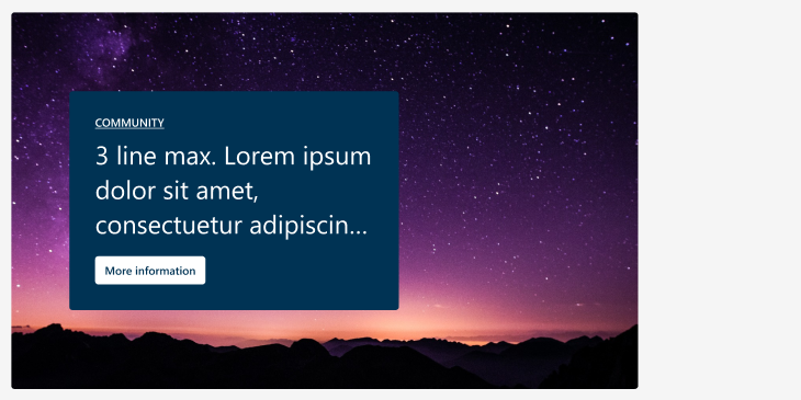
Hero
One is displayed large and the rest are small beside it.
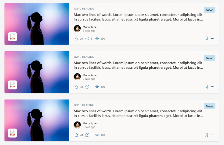
List
They are displayed one below the other. The “Related content” variant shows less information.
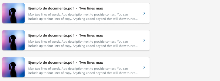
Related content list
The “Related content” variant shows less information.
Column set
They are displayed one below the other.

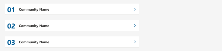
Numbered list
They are displayed one below the other with the order number.
Carousel
They are displayed within a carousel.

Variant without description
Colors and contrasts
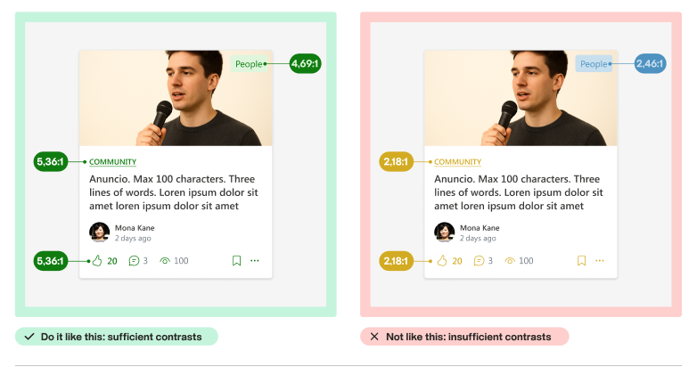
Ensure there is sufficient contrast between text colors, graphic elements, and background colors to help users with visual disabilities read and view content easily.
Minimum contrast ratio requirements for text
- Large text (minimum 19px bold or 24px regular): 3:1 contrast ratio
- Normal text (smaller than large text): 4.5:1 contrast ratio
Minimum contrast ratio requirements for graphic elements: 3:1 contrast ratio
This includes:
- Interactive elements and their states
- Interface elements that provide visual information to the user to understand the content.
Does not include:
- The disabled state of an interactive component
- Interface elements that are decorative and do not provide visual information to the user to understand the content.
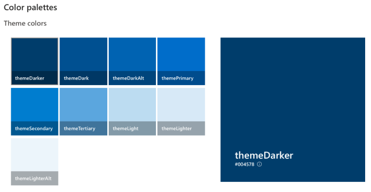
By default, our Cards are already designed so that the contrasts exceed the minimum necessary ratio.
Fluent UI Theme Designer
This tool allows developers and designers to create and customize visual themes for applications using Fluent UI. It has features that can help you calculate the contrast ratio between two colors and ensure that the selected colors meet accessibility standards:
- Contrast ratio calculation: allows you to evaluate the contrast between text color and background color, showing whether or not they meet the recommended criteria.
- Color suggestions: as you choose colors, the tool can suggest combinations that meet the necessary contrast guidelines, helping you select an appropriate palette.
- Contrast visualization: provides a preview of how the selected colors will look in the interface, which helps identify accessibility issues before implementing the design.
Other Theming Designer features:
- Color customization: users can choose and adjust colors for different interface elements, such as background, text, borders, etc., using an interactive color palette.
- Automatic preview: allows you to get a preview of design changes in real time. As colors and styles are modified, you can see how they affect the appearance of components in the application.
- Theme export: once a custom theme is created, users can export the color and style configuration in JSON code format, which can be easily integrated into applications that use Fluent UI.
- Theme integration: facilitates the integration of custom themes into applications in a simple and effective way, making adaptation to different brands or designs faster.
- Compatibility: allows you to work with materials and components that already use Fluent UI, ensuring that themes are applied correctly to all elements.
Theme Slots
The concept of Theme Slots in Fluent UI refers to a system that allows defining and applying styles consistently and dynamically within an application. This facilitates customization and adaptation of the application’s visual appearance according to different business rules or user preferences.
- Consistency: provides a uniform set of styles that are applied across different components, ensuring that the entire application has a cohesive appearance.
- Customization: allows for quick and easy changes to colors and styles, which is useful for brand adaptation or application theming.
- Efficient maintenance: by centralizing style management, it simplifies the maintenance and updating of the application’s design.
Alternative text for images
Alternative text (or “alt text”) is a textual description provided for images in digital content. Its purpose is to offer information about the image to users who cannot see it, such as blind people who use screen readers.
- Accessibility: allows people with visual disabilities to understand the content and context of images.
- SEO: improves search engine optimization by providing additional information about the image content.
- Image loading: in case the image doesn’t load, the alternative text is displayed instead, informing the user about what should be there.
Tips for writing alternative texts
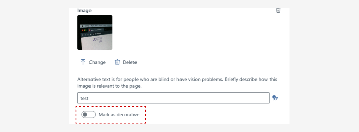
Before writing alternative text, you must define whether the image is decorative or not.
Decorative image
An image is decorative:
- if it functions as decoration, is a background or an addition that does not add meaning to the content.
- if I remove it from the design and the content is understood the same way.
- when there is already related text that explains what is displayed in the image.
The vast majority of images are decorative. If you have the option to “mark as decorative”, do it.
Informative image
It will be an informative image if:
- it provides value or relevant information for the user.
- when removed from the design, information is lost or the meaning of the content changes.
In these cases, you must provide alternative text that describes what you want to convey with that image in the context in which it is found, some tips:
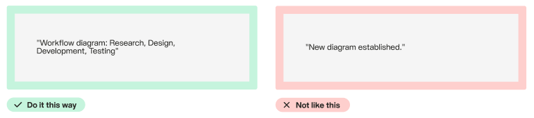
Descriptive Describe the image clearly and concisely. Include relevant information that helps understand the context.
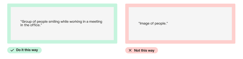
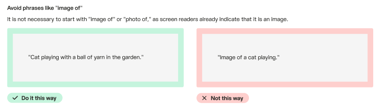
Avoid phrases like “image of” It is not necessary to start with “image of” or “photo of”, as screen readers already indicate that it is an image.
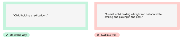
Keep it brief The alternative text should be brief, ideally between 100 and 125 characters, to facilitate reading.
Consider the context Make sure the alternative text is relevant to the content in which the image is found.