How to configure addons
Audience: This article is intended for Syntphony admins
Discover how to configure an Addon that will allow you to create new content types with their own configuration, custom cards and forms
Overview
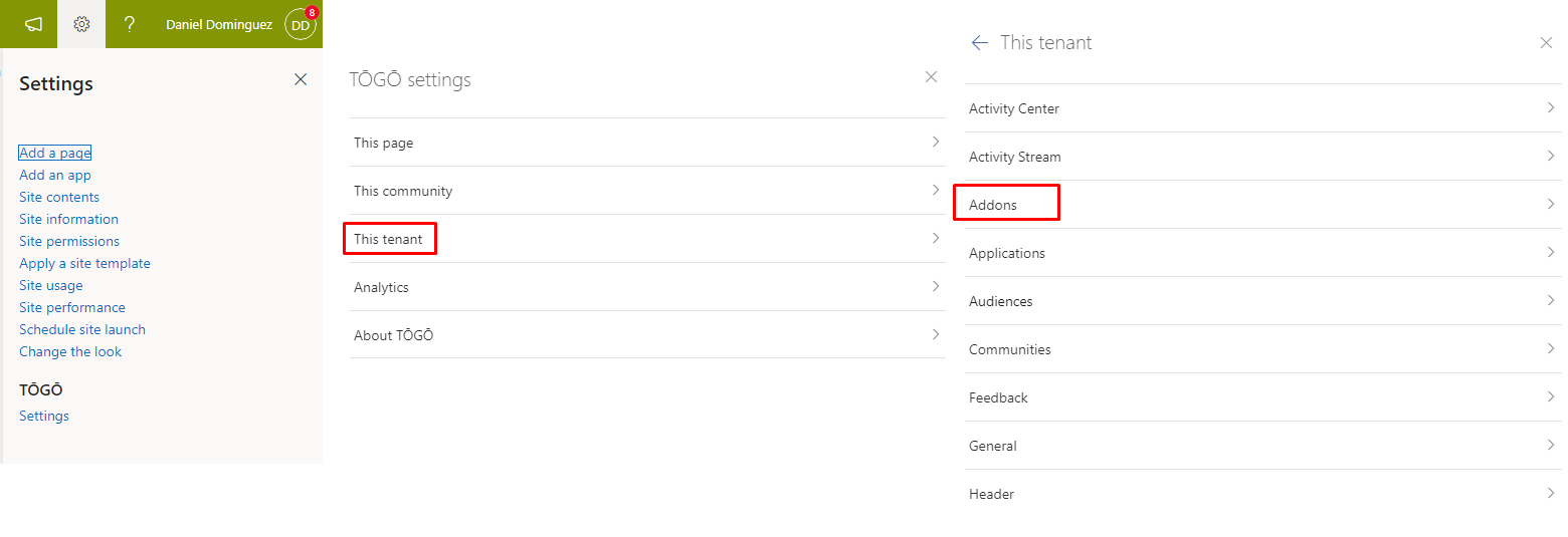
To access the addons settings it is necessary to open the Syntphony settings.
Syntphony settings > This tenant > Addons
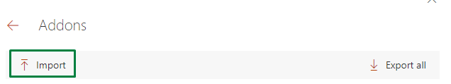
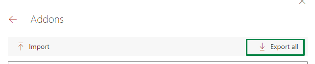
Import addon
Clicking on the “import” button will open a panel where you can copy/paste the configuration of an addon or upload a JSON file.
When uploading it will be displayed in the code editor.
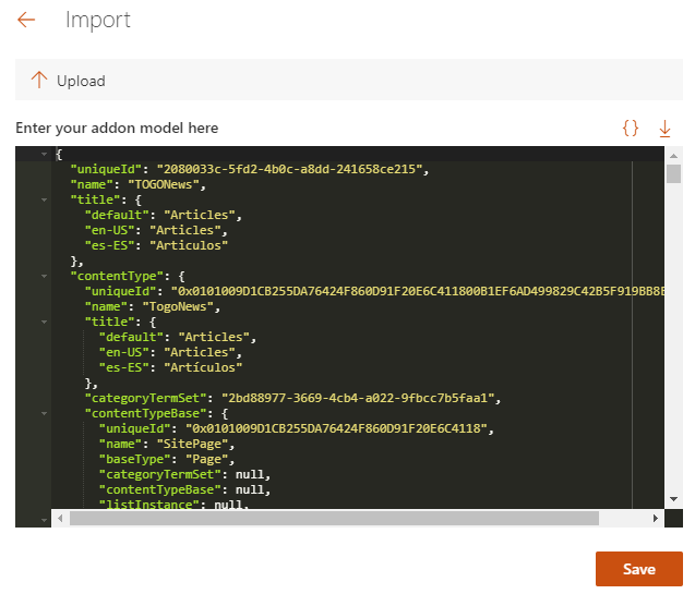
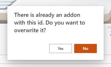
If you import an existing addon, with the same unique id, when saving a warning will appear to confirm if you want to overwrite the current addon.
Export all addons
Just like we can import an addon, we can also export all the addons at the same time. With this option, we will download a zip file with the JSON files of the addon’s configuration.
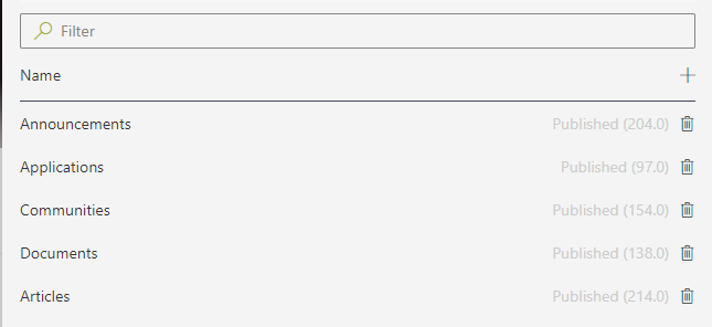
Addons list
In the list of addons we can filter them by name, create and delete them, see the status and see what version they are in.
The addon can have two states:
- Published: well-configured addon that is currently active.
- Draft: addon that is not yet published. Those that are not fully configured should be saved as a draft.
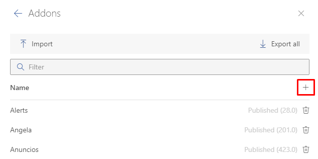
How to create an addon
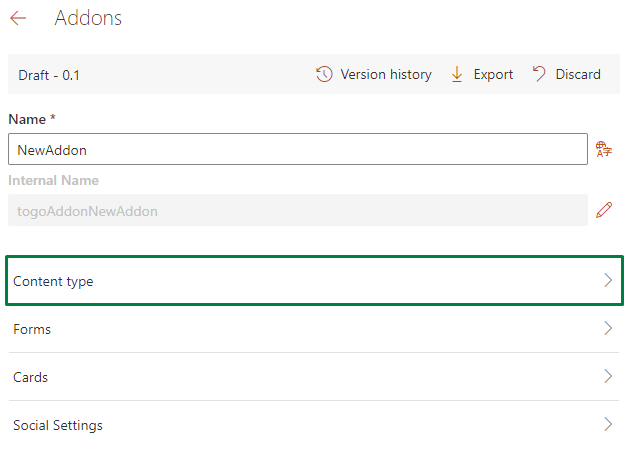
To create a new addon, click on the plus symbol in the list and it will take us to a screen where we will have to enter a name to start the configuration.
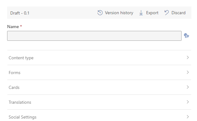
An internal name is automatically created with the name entered but it can be modified by clicking on the pencil.
We can see the top bar which gives us some information such as the status and version. And it also lets us access a version history, export the addon and discard all changes since the last save.
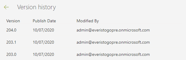
Version history
When entering the version history we can see a list with all the published or draft versions, see the modification date, and who was the last to modify it.
And if you click on an addon you will get a modal to restore this addon.
Content type
A content type is a reusable collection of metadata (columns), workflow, behavior, and other settings for a category of items or document libraries.
Content types enable you to manage the settings for an addon and its behavior.
To see how to configure a content type, go to this article.
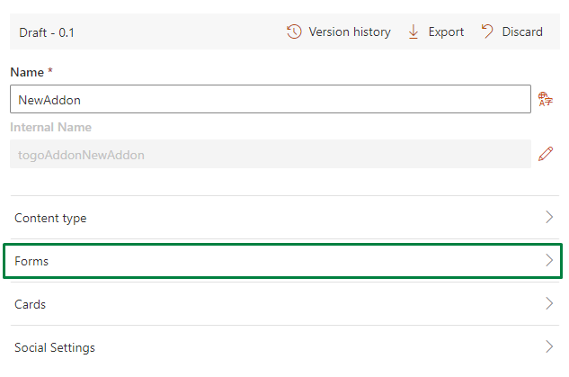
Forms
In the forms section, we have 3 forms that are common to all addons and a list to add additional forms.
These forms can be assigned to some actions, such as clicking on a button or a card.
Setting up a form
In all the forms we can configure:
- Name: text that will appear in the header of the form panel
- Load bundle: (Deprecated) A bundle is an external solution that uses the syntphony Apps model. If we select this option we can use a bundle by inserting the URL and the class name in their corresponding field.
- Get endpoint: It is the API endpoint where it will be called as soon as the form is opened. With the answer we can fill in the fields of the form using them as variables.
- Design: JSON to configure the form design. To see more about how to configure the form design go to the next article
- Submit model: It is the model that will be sent when submitting the form. The properties of the model correspond to the name that we put in the form design
- Show form preview: if we check this option, a preview of the form that we have created will open and we will be able to fill in the sample data using the editor
- Sample data: Simulates the model returned by the endpoint api. The properties that we put in this model can be seen reflected in the form preview
Cards
A card is the way we have to paint the addon.
We can create all the designs we want and use them on sites such as a form or the dashboard
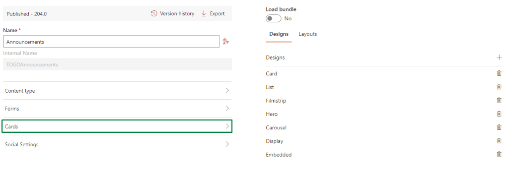
Setting up a card
To create an addon click on the plus icon. This will open a panel to configure a card
- Id: unique id autogenerated to be able to refer to this card from a form for example.
- Name: name to identify this card on the list
- Design: JSON to configure the design of the card. To see more about how to configure the design of the card go to the next article.
- Base unique id: It indicates in which part of the JSON, which is returned by the endpoint, the unique id of the content is found.
- Show card preview: if we check this option, a preview of the card that we have created will open and we will be able to fill in the sample data using the editor
- Sample data: Simulates the model returned by the endpoint API. The properties that we put in this model can be seen reflected in the card preview
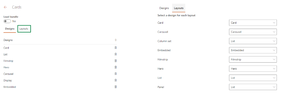
In the layouts screen, we can select a design already created for each and every one of the layouts that we have in the Syntphony dashboard in addition to selecting one for the panels.
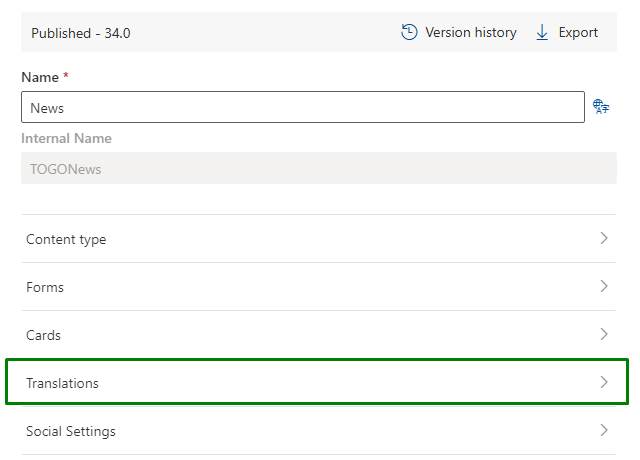
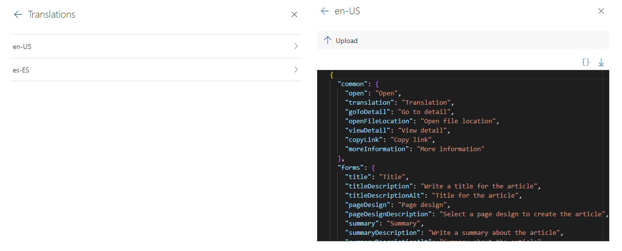
Translations
From this section, you can easily add translations for the literals used in both forms and cards. The available languages will match those configured in the tenant.
To use these literals in both forms and cards, simply follow this format:
{
"name": "title",
"type": "Text",
"label": {
"t": "forms.title"
},
"description": {
"t": "forms.titleDescription"
},
"validation": {
"required": true
}
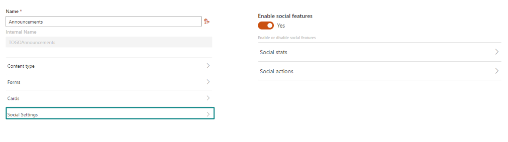
}Social Settings
In this section, you can configure all the social settings for this addon.
For example, hide the “like” button, that visits are not shown, that it cannot be marked as a favorite or bookmark, etc.
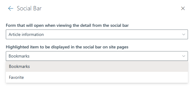
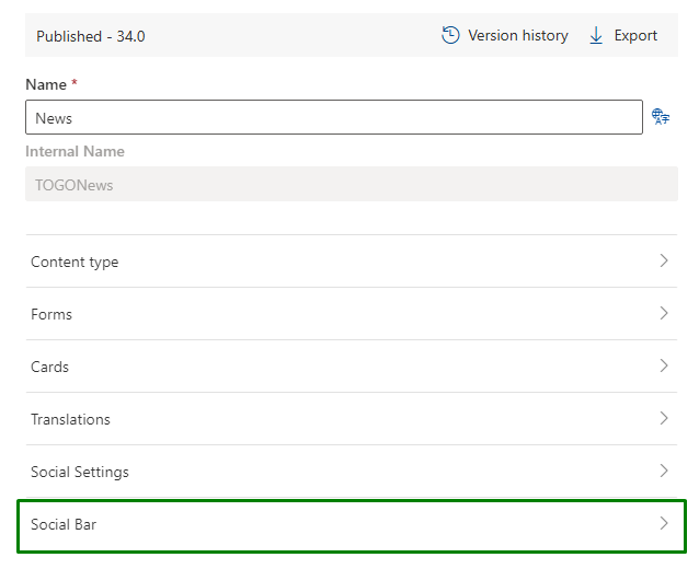
Social Bar
The Social Bar feature is only available within addons that inherit from the SitePage content type.
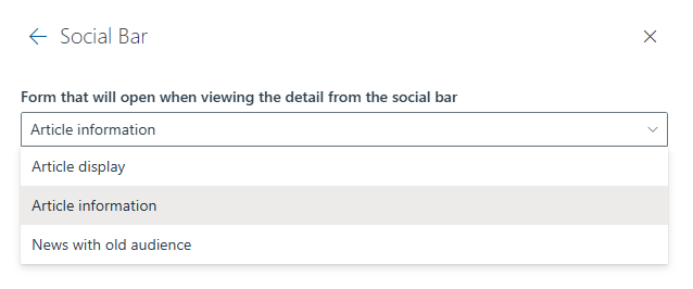
In this section, you can configure the following options:
- Detail form: The form that will be displayed when clicking on the “View detail” button in the social bar.By product decision, you will only be able to choose between the display form and any additional forms.
- Hightlighted item: The item that will be highlighted in the social bar. There are two options:
- Bookmarks
- Favorite