Navigation
Audience: This article is intended for Syntphony admins
This section explains how users can navigate between pages and sections within the tool, as well as the configuration options to make navigation as accessible and intuitive as possible.
Syntphony offers two types of menus:
- Global menu
- Profile menu
What is the global menu?
The global menu is a strip that can be displayed vertically or horizontally at the top or side of the page. This menu remains always visible and offers a quick and intuitive way of navigation.

It includes frequently used elements such as “Home”, “Blog”, or “Contact”, but you can configure it to display any other tool that is needed.
The menu is fully accessible due to:
- The use of a clear and legible font
- Different color schemes that allow clear visualization
- Hover effects when the user interacts with the menu
- Drop-downs to display different menu levels
- Responsive design that adjusts to all screen sizes, collapsing into a “hamburger” design on smaller resolutions
Menu versions
Syntphony provides two menu implementations:
| Feature | Menu (default) | Legacy Menu |
|---|---|---|
| Hierarchy levels | Up to 3 levels | Up to 2 levels |
| Keyboard navigation | Full ARIA support with arrow keys | Basic |
| Layout modes | Sidebar (rail/expanded) + Top menu + Mobile | Sidebar + Top menu |
| Collapsible sidebar | Rail (icons) ↔ Expanded (icons + text) | Collapsed ↔ Expanded |
| Top/Bottom item grouping | Yes (isTop field) | No |
| Expanded Image per item | Yes | No |
| Mobile accordion | Built-in responsive accordion | Hamburger menu |
The Menu is used by default. To use the legacy menu, set useLegacyMenu: true in the configuration.
For details on each implementation:
What is the profile menu?
This menu, located at the top right of the screen, shows users customized controls and options tailored to their accounts and preferences. It is only visible to users who have a profile on the tool.
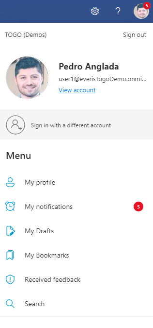
The profile menu usually includes items such as the Activity Center, My Activity, My Applications, My Bookmarks, My Professional Profile, and more.
How to configure the menu?
The tool allows you to configure two aspects of the menu:
- The display style of the menu
- The items displayed in the menu
How to configure the global menu display?
To configure the main menu style, go to: Syntphony settings > This tenant > Main Menu
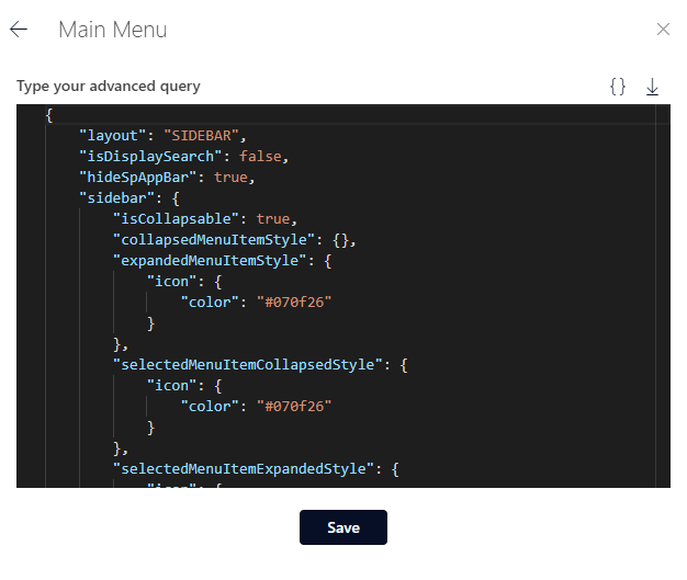
The parameters you need to know to edit the menu are:
- layout: Configure the position of the global menu:
SIDEBAR: Display the menu verticallyTOPMENU: Display the menu horizontally
- useLegacyMenu: Set to
trueto use the Legacy Menu. Whenfalseor not set, the default Menu is used. - isDisplaySearch: If set to true, a search field will appear in the menu
- sidebar: Customize the style of the menu when displayed as a sidebar
- isCollapsable: Controls whether the sidebar can be toggled between collapsed (rail) and expanded states. When
false, the sidebar is always expanded.
- isCollapsable: Controls whether the sidebar can be toggled between collapsed (rail) and expanded states. When
- topMenu: Customize the style of the menu when displayed as a horizontal bar
- hamburguerMenu: Customize the style of the global menu when it collapses into a “hamburger” icon
Within the last three parameters, there are more options to customize parts of the menu, such as its color, icon color, selected menu item color, etc. These customizations can be applied depending on whether the menu is collapsed or expanded.
Layout previews
Depending on the layout value, the menu will be rendered differently. Below are visual examples of each available layout:
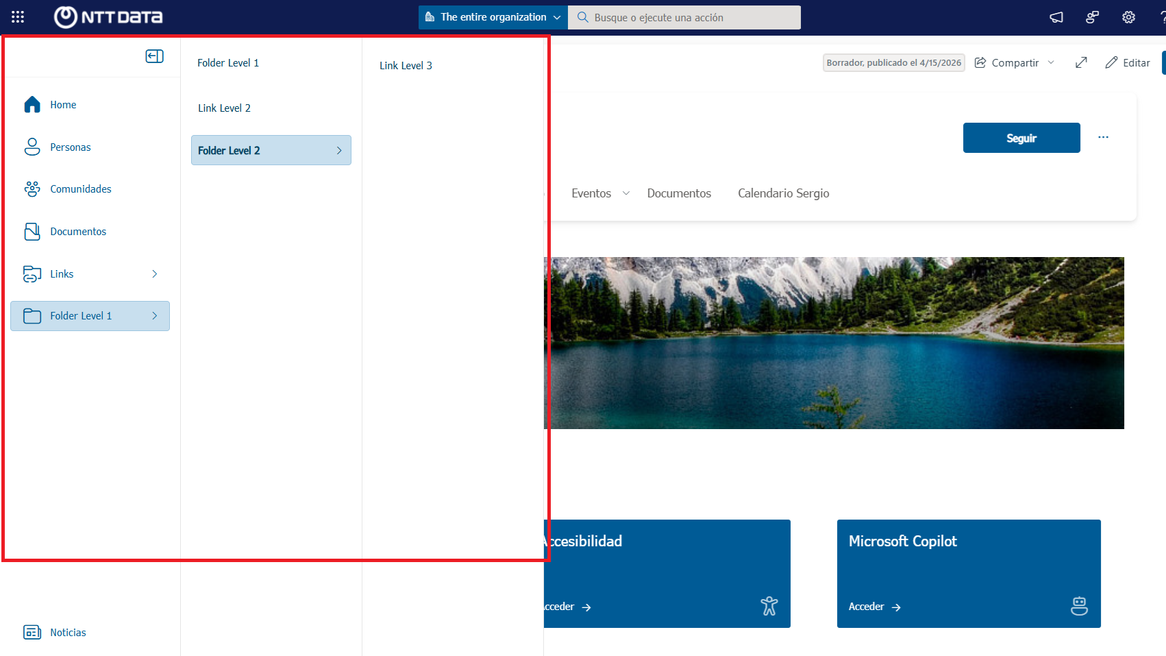
Sidebar (vertical)
The menu is displayed as a vertical strip on the left side of the page. It can be collapsed to a rail (icons only) or expanded (icons + text).
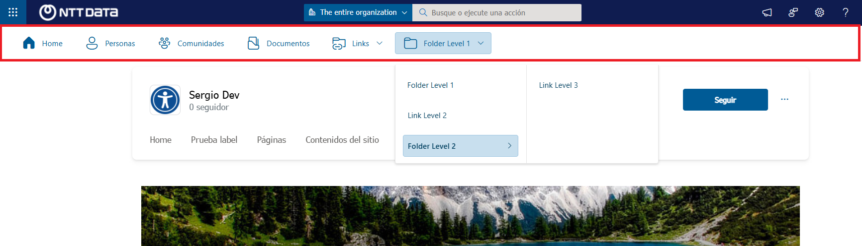
Top menu (horizontal)
The menu is displayed as a horizontal bar at the top of the page.
Mobile
On small screen sizes, the menu collapses into a responsive accordion accessible through a hamburger icon.
After configuring the style, press the Save button and refresh the page to see the changes.
For inspiration, you can find some configuration examples at the following link.
Alternatively, you can view detailed configuration options at the following link.
How to configure the menu items?
You can edit, delete, or create new menu entries. To do this, access the relative URL: /sites/togo/Lists/SidebarMenu/AllItems.aspx
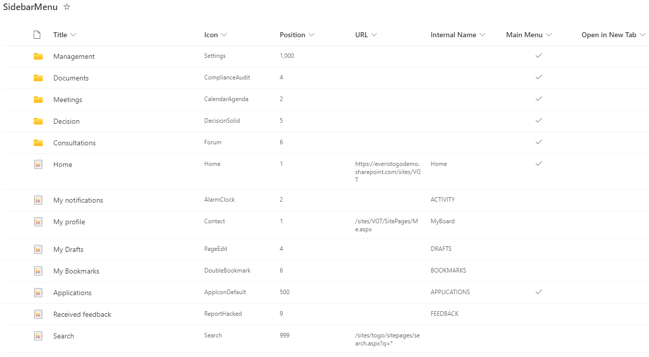
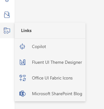
- Title: The name of the component visible to the user when navigating the tool
- Icon: The name of the icon used in the menu. The value can be:
- The name of an Office UI Fabric icon
- URL: The URL to which the menu entry redirects
- Internal Name: This column can be filled in to use the components offered by the tool. The options are:
- FAVORITES
- BOOKMARKS
- APPLICATIONS
- DRAFTS
- FEEDBACK
- ACTIVITY
- Main Menu: Indicates whether the item appears in the global menu or the profile menu. If checked, the item will only appear in the global menu.
- Open in New Tab: Indicates whether the menu item opens in a new tab or the same tab.
- Position: A numeric value that indicates the order in which the item will be displayed in the menu. Lower numbers appear first.
- Expanded Image: Allows you to specify a different image to be displayed when the sidebar is expanded (Menu only). This replaces the icon with a richer image when the sidebar is in expanded mode.
- Styles: Allows you to specify a different style for the menu item. This can include options like color, font size, and other CSS properties to customize the appearance of the menu item (legacy menu only).
- Top: Indicates the position of the menu item. If this option is active (checked), the item will appear at the top of the main menu. If it’s inactive (unchecked), the item will appear at the bottom of the menu.
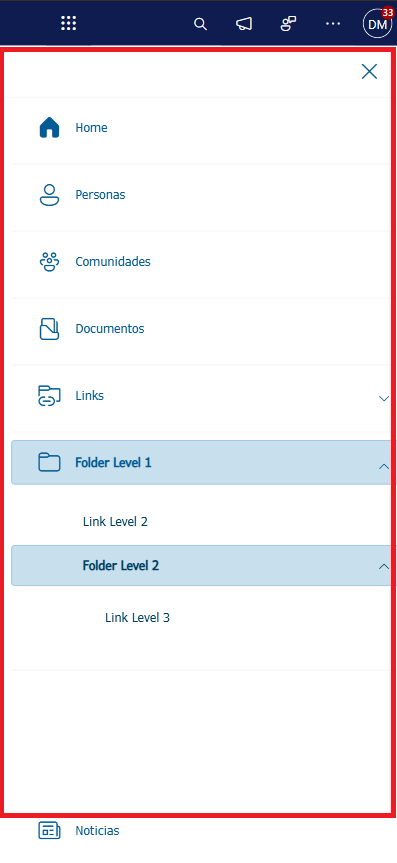
Menu item hierarchy
The Menu supports up to 3 levels of hierarchy. Items are nested using the
parentId field in the SharePoint list, or by providing nested items arrays
in the configuration object. The Legacy Menu only supports 2 levels.
- Level 1: Root items visible in the rail/expanded sidebar/top bar
- Level 2: Children of Level 1 items, shown in a flyout column when the parent is activated
- Level 3: Children of Level 2 items, shown in a second flyout column
Items are sorted by their order (position) value within each level. Items beyond level 3 are ignored.
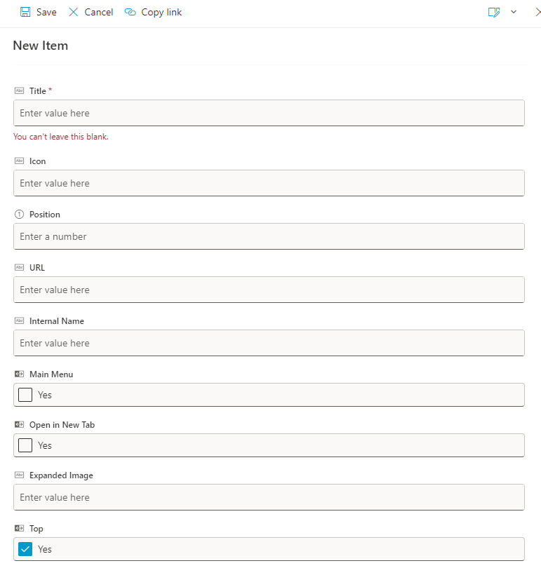
To create a new menu entry, click on the New button at the top of the screen.

Once you have clicked the button, a pop-up window will appear where you must fill in all the fields with the information related to the new menu.
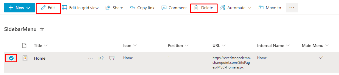
Existing menu entries can be edited or deleted by selecting them and clicking on the desired action button.
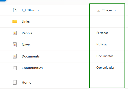
If you are using the multi-language feature and want to use a different title for each language, a column with the configured languages in the tenant will be created. In this column, you can specify the title to be used for each language.
You can also create a “Togo Sidebar Folder”
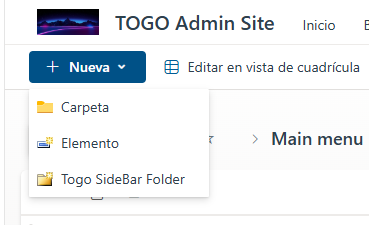
Within this folder, you can add multiple menu items and group them. These items will be displayed in the Main Menu as a second-level grouped section.
Changes applied to the global menu may not appear immediately, so it is necessary to clear the cache by following these steps:
Click on Syntphony settings > This tenant > Main Menu > Click on the save button