Examples
Menu Examples
These examples use the default menu (useLegacyMenu not set or false).
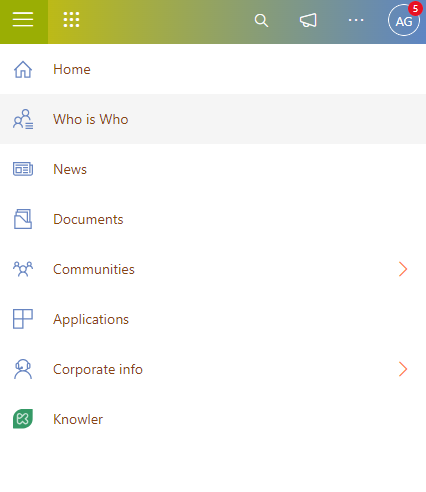
Sidebar - Collapsible (default behavior)
The most common configuration. The menu starts collapsed as a rail showing icons, and users can expand it to see text labels.
{
  "layout": "SIDEBAR",
  "sidebar": {
    "isCollapsable": true
  }
}
Result:
- Collapsed state: 60px rail with icon buttons and tooltips
- Expanded state: 240px panel with icons + text (floats over content)
- Toggle button visible at the top
Sidebar - Always expanded
For environments where users should always see the full menu text.
{
  "layout": "SIDEBAR",
  "sidebar": {
    "isCollapsable": false
  }
}
Result:
- Sidebar is always 240px
- Page content is pushed right with a 240px margin
- No toggle button shown
Top Menu - Horizontal bar
Menu items displayed horizontally below the header.
{
  "layout": "TOPMENU"
}
Result:
- Items displayed in a 64px horizontal bar
- Children show as dropdown flyout on click
- Supports up to 3 levels in the flyout
Three-level hierarchy
Example of nested items up to 3 levels deep.
{
  "items": [
    {
      "uniqueId": "communities",
      "text": "Communities",
      "order": 1,
      "icon": "People",
      "isTop": true,
      "items": [
        {
          "uniqueId": "community-tech",
          "text": "Technology",
          "order": 1,
          "items": [
            {
              "uniqueId": "community-tech-frontend",
              "text": "Frontend Development",
              "order": 1,
              "url": "/communities/tech/frontend"
            },
            {
              "uniqueId": "community-tech-backend",
              "text": "Backend Development",
              "order": 2,
              "url": "/communities/tech/backend"
            }
          ]
        },
        {
          "uniqueId": "community-design",
          "text": "Design",
          "order": 2,
          "url": "/communities/design"
        }
      ]
    }
  ]
}
Result in sidebar rail mode:
- “Communities” appears as an icon in the rail
- Clicking it opens a flyout column with “Technology” and “Design”
- Clicking “Technology” opens a second column with “Frontend Development” and “Backend Development”
Top and Bottom grouping
Separate main navigation from utility items.
{
  "items": [
    {
      "uniqueId": "home",
      "text": "Home",
      "order": 1,
      "icon": "Home",
      "url": "/home",
      "isTop": true
    },
    {
      "uniqueId": "documents",
      "text": "Documents",
      "order": 2,
      "icon": "Document",
      "url": "/documents",
      "isTop": true
    },
    {
      "uniqueId": "settings",
      "text": "Settings",
      "order": 1,
      "icon": "Settings",
      "url": "/settings",
      "isTop": false
    },
    {
      "uniqueId": "help",
      "text": "Help",
      "order": 2,
      "icon": "Help",
      "url": "/help",
      "isTop": false
    }
  ]
}
Result:
- Home and Documents appear at the top of the rail/sidebar
- Settings and Help appear at the bottom, separated from the main items
Expanded Image per item
Show a richer image when the sidebar is expanded.
{
  "items": [
    {
      "uniqueId": "brand",
      "text": "Our Brand",
      "order": 1,
      "icon": "Branding",
      "expandedImage": "/images/brand-logo-full.png",
      "url": "/brand",
      "isTop": true
    }
  ]
}
Result:
- Rail mode: shows the Fluent UI “Branding” icon
- Expanded mode: shows the custom
expandedImageinstead of the icon
Legacy Menu Examples
These examples require useLegacyMenu: true.
Configure the look and feel of the sidebar visualization
Modify the style for sidebar: In the next screenshot, it has been added different colors at text and icons of the elements inside of Menu in two-state, when the sidebar is expanded or collapsed.
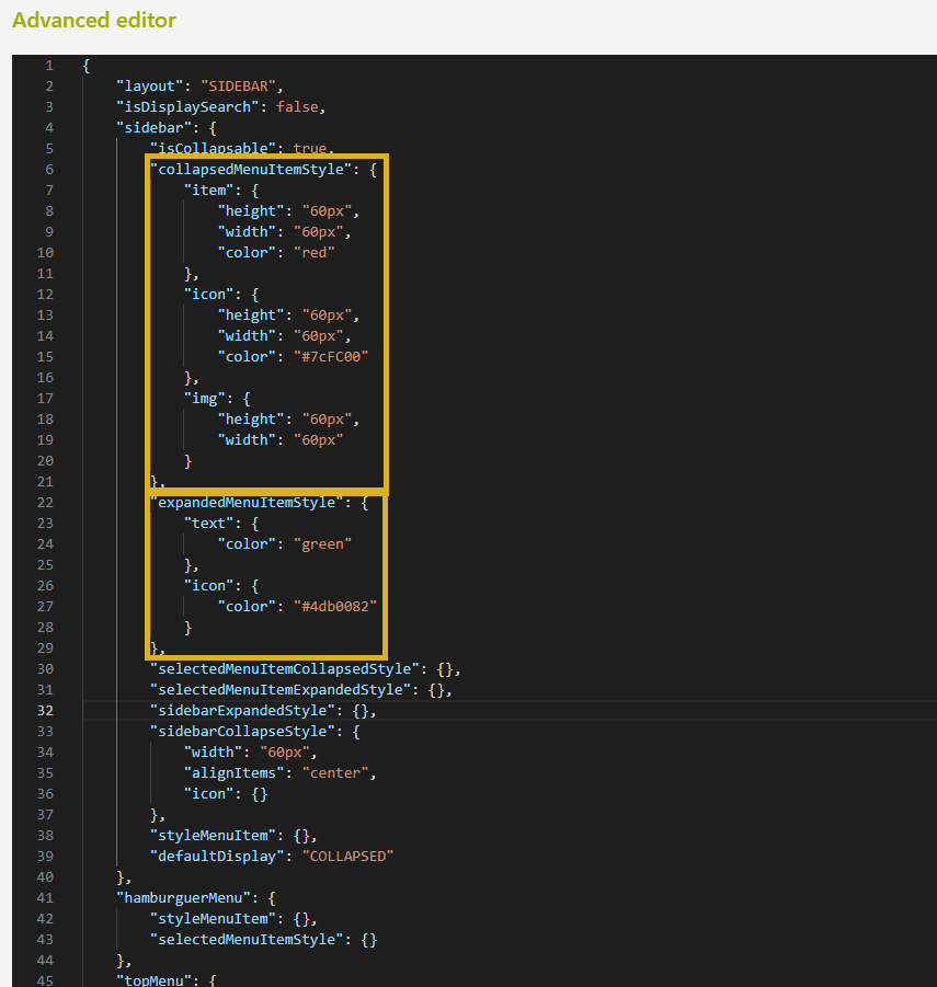
The parameters modified were the “collapsedMenuItemStyle” and “expandedMenuItemStyle” for change the color of the items inside of Sidebar.
In this case, you have modified only the items inside of the sidebar and not the complete sidebar, for this reason, the Search and Right Chevron do not change of color as the other items. In this way, you have more freedom to personalize these icons.
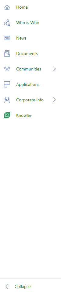
| Sidebar Menu Collapsed | Sidebar Menu Extended |
|---|---|
 |  |
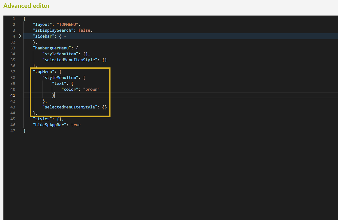
Configure the look and feel of the top menu visualization
Enable and change the style of Top Menu instead of classical Sidebar:
These are the parameters to change the color of the items inside of the Top Menu:
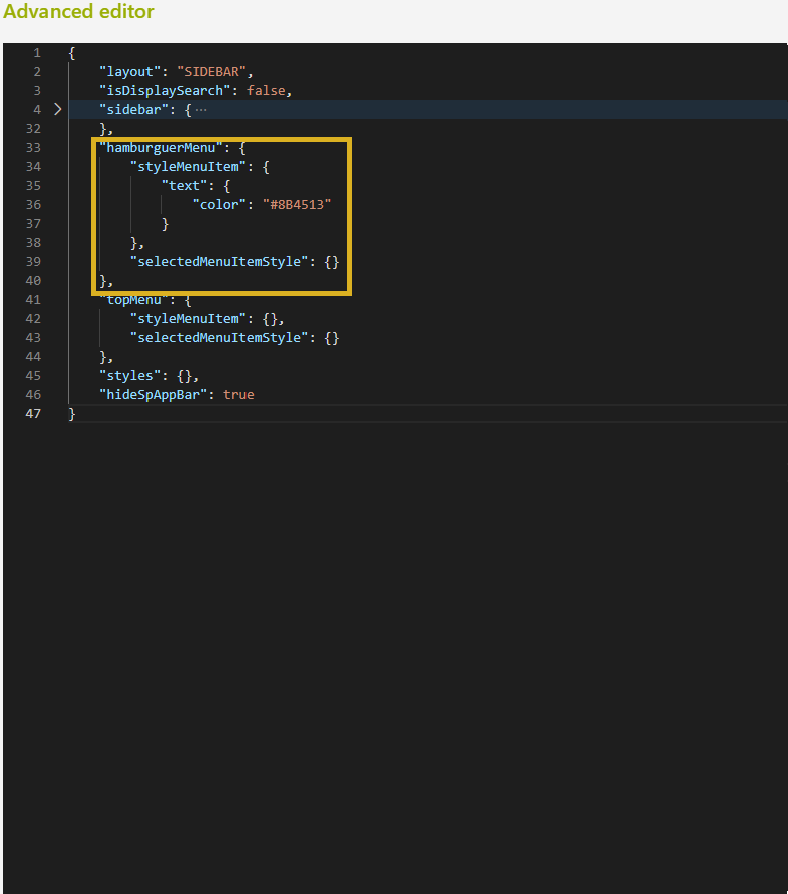
Configure the look and feel of the hamburger menu
Other modifications are for the style of the text and icon when the users watch the page through mobile.
The parameters modified for change the color of items in Hamburger layout: