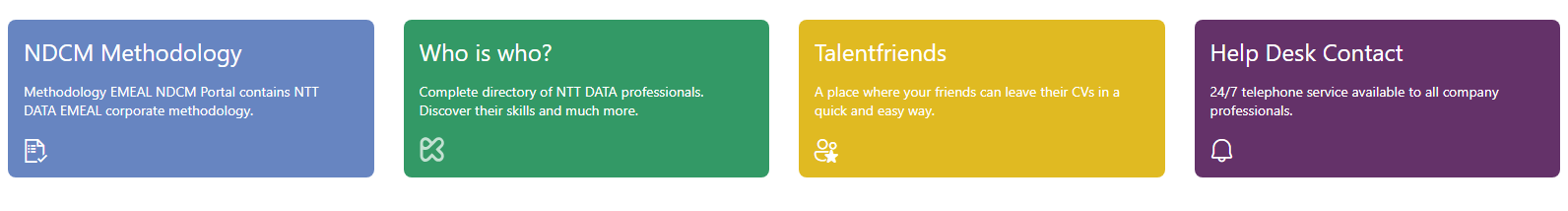
Customizable Quick Links Webpart
Discover how to create and configure the Customizable Quick Links webpart that will allow you to show quick links or call to actions with more customization than out of the box webpart.
Setting up Customizable Quick Links
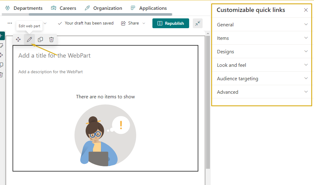
To access the Customizable Quick Links configuration it is necessary to add it to a page and the page is in edit mode. We can access the configuration panel by clicking on the edit action that appears at the top left of the Customizable Quick Link webpart. When you click on the edit button, the panel that allows you to configure the Customizable Quick Links properties will appear on the right side of the screen.
General
In this section, you’ll learn how to modify the title and description, add a navigation link, an action, decide whether to hide the Customizable Quick Link webpart when there is no content to display, select the display orientation and show horizontal separator or not/
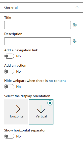
Title and Description
You can configure the web part’s title and description directly from the placeholder with the following text:
- Title: “Add a title for the web part”
- Description: “Add a description for the web part”
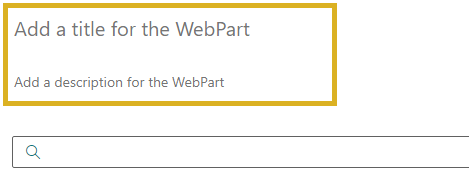
Both can be customized when the page is in edit mode. If you leave the title or description fields blank, no default text will be displayed.
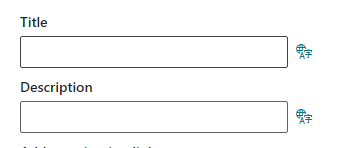
These settings can also be edited from the web part configuration panel, and they support multilanguage, allowing you to provide different text for each language configured in your tenant. You can also add a navigation link, which we will discuss in more detail below.
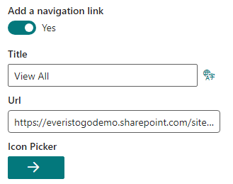
Adding a Navigation Link to the Customizable Quick Links Header
You have the option to include a navigation link that will be displayed at the top right of the Customizable Quick Links. To activate it, toggle the option and provide the necessary information, including a title and the URL to which you want users to be redirected. Additionally, you can select an icon from the available list by clicking the “Icon” button.
Once configured, the link will appear on the right side of the Customizable Quick Links header.
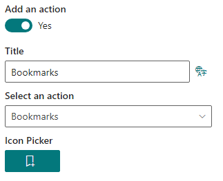
Adding an Action to the Customizable Quick Links Header
Similar to adding a navigation link, you can also incorporate an action. This can be set up in a similar manner to the navigation link, but instead of specifying a URL, you must select an action. This action will open a panel with one of the following options: Favorites, bookmarks, applications, drafts, feedback, or activity
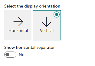
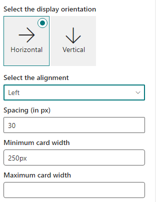
Selecting the display orientation
You can choose the orientation of the Customizable Quick Links on your website. There are two options: vertical or horizontal.
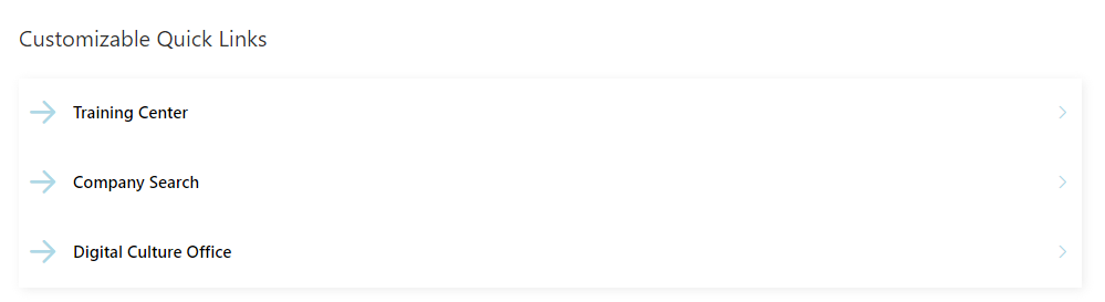
Vertical Orientation
The vertical orientation is the default option. It displays the Customizable Quick Links as a column of cards. You can also add a horizontal separator between the cards to make them more distinct.
Horizontal Orientation
The horizontal orientation displays the Customizable Quick Links as a row of cards. You can configure the following settings for this option:
- Alignment: You can align the cards to the right, left, center, or justify them to fill the available space.
- Spacing: You can adjust the spacing between the cards to create gaps.
- Card Width: You can set the minimum and maximum width of the cards to control their size.
Important: The orientation of the Customizable Quick Links does not affect the design of the cards. Therefore, it is advisable to choose or create a design that fits well with the selected orientation.
Items
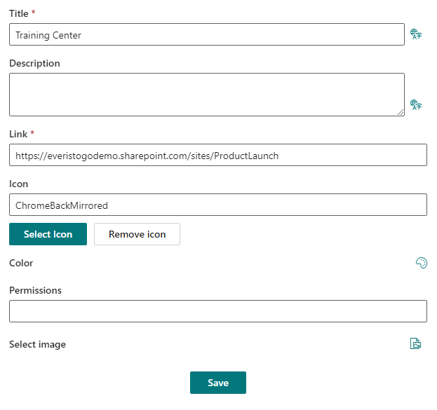
In the “Items” section we can create new links and manage existing ones. To create a new one, click on Add new item and fill in the form.
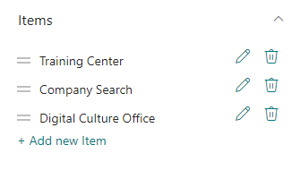
The only required fields are the title and the link, but we can also add other information such as description, color, icon, image, and permissions.
Later in the card designer, we can use this data as we want. For example, use the color as the background of the card.
Designs
In the “Design” section we can create new designs, manage existing ones and select what design we want to use. By default there are three designs, one for the vertical orientation and 2 for the horizontal.
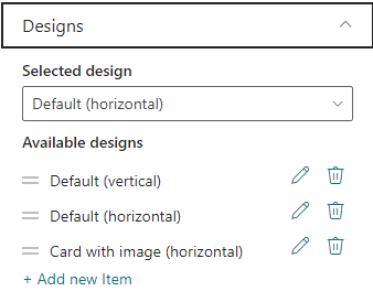
To create a new design or modify an existing one, we can do it by clicking on the pencil or “add a new item”. This will open a panel in which you can completely modify the design to your liking.
To see how to create or edit a design you can go to the following article.
For inspiration on creating more designs, you can explore the designs we offer at Syntphony. Take a look at our available designs here, which can serve as a starting point for your own creative endeavors. These designs showcase the possibilities and can provide insights on how to tailor your content for an engaging and visually appealing user experience. Feel free to leverage these examples to spark ideas and enhance the aesthetics of your content.
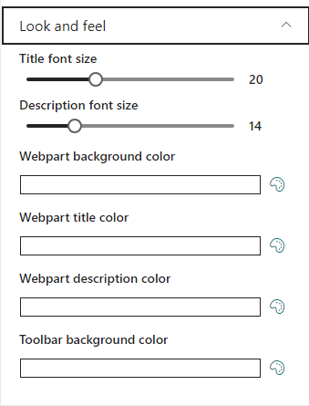
Look and feel
In this section, you have the ability to make the following visual adjustments:
- Adjust the font size of both the title and description.
- Modify the background color of the web part, the toolbar, and the title and description.
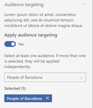
Audience targeting
In this section, you have the option to determine whether to apply audience targeting. If you choose to apply audience targeting, the web part will only be visible to individuals who belong to the selected audiences. To make these selections, a selector will open, allowing you to choose which audience(s) to apply to this web part. This feature ensures that the web part is displayed to the intended audience, making your content delivery more precise and personalized.
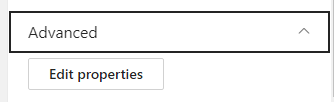
Advanced
In this section, advanced users have the capability to edit all web part properties using a configuration JSON. This feature provides a high level of customization and control over the web part’s settings.